
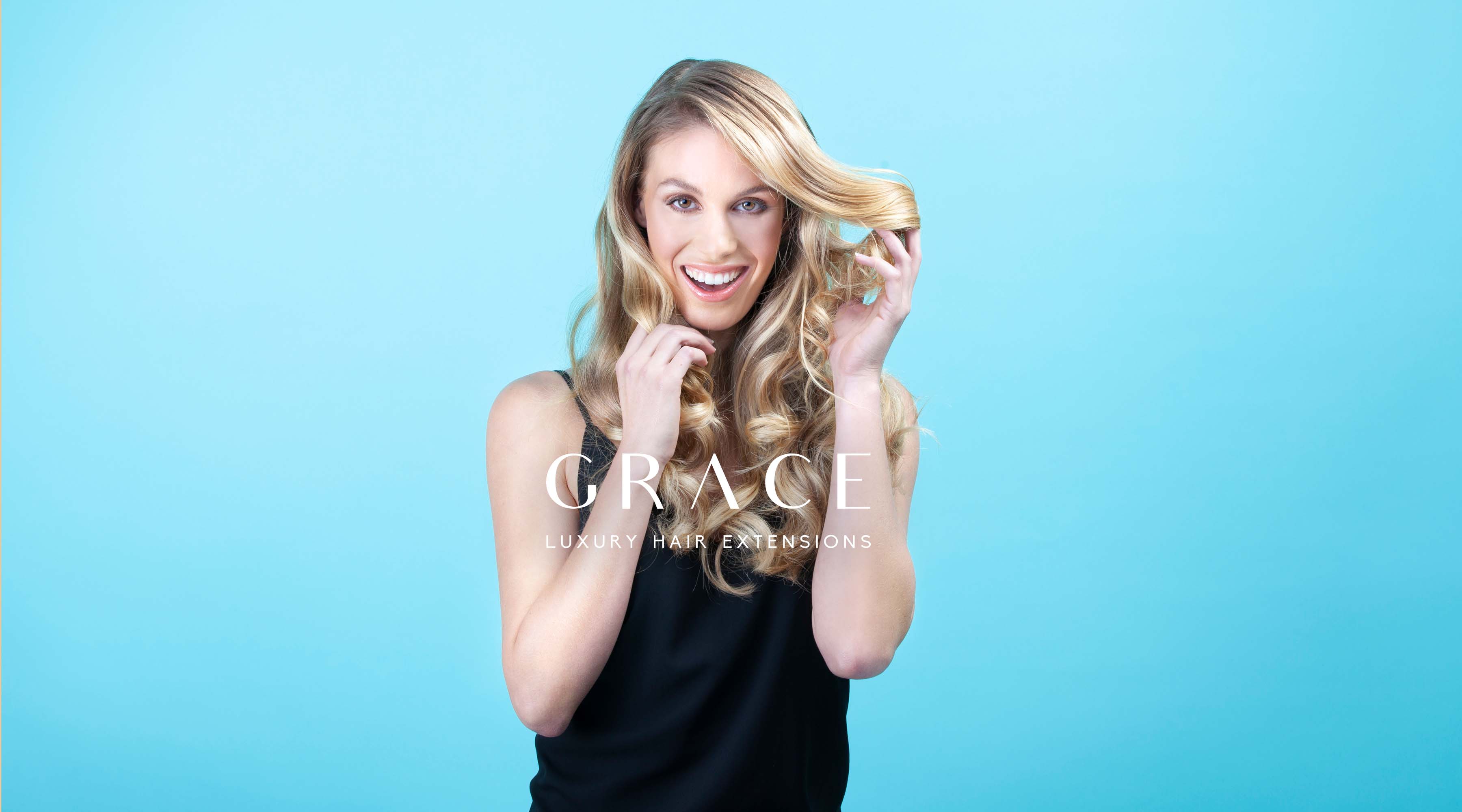
GRACE HAIR EXTENTIONS
LOGO, PACKAGING,BRANDING, GRAPHIC DESIGN, HAIR & BEAUTY, PHOTOGRAPHY
The Challenge
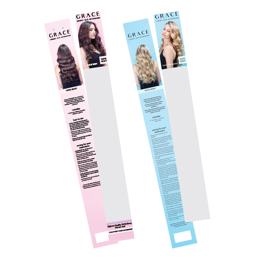
Update old packaging designs which used stock photography that wasn’t unique and looked dated.
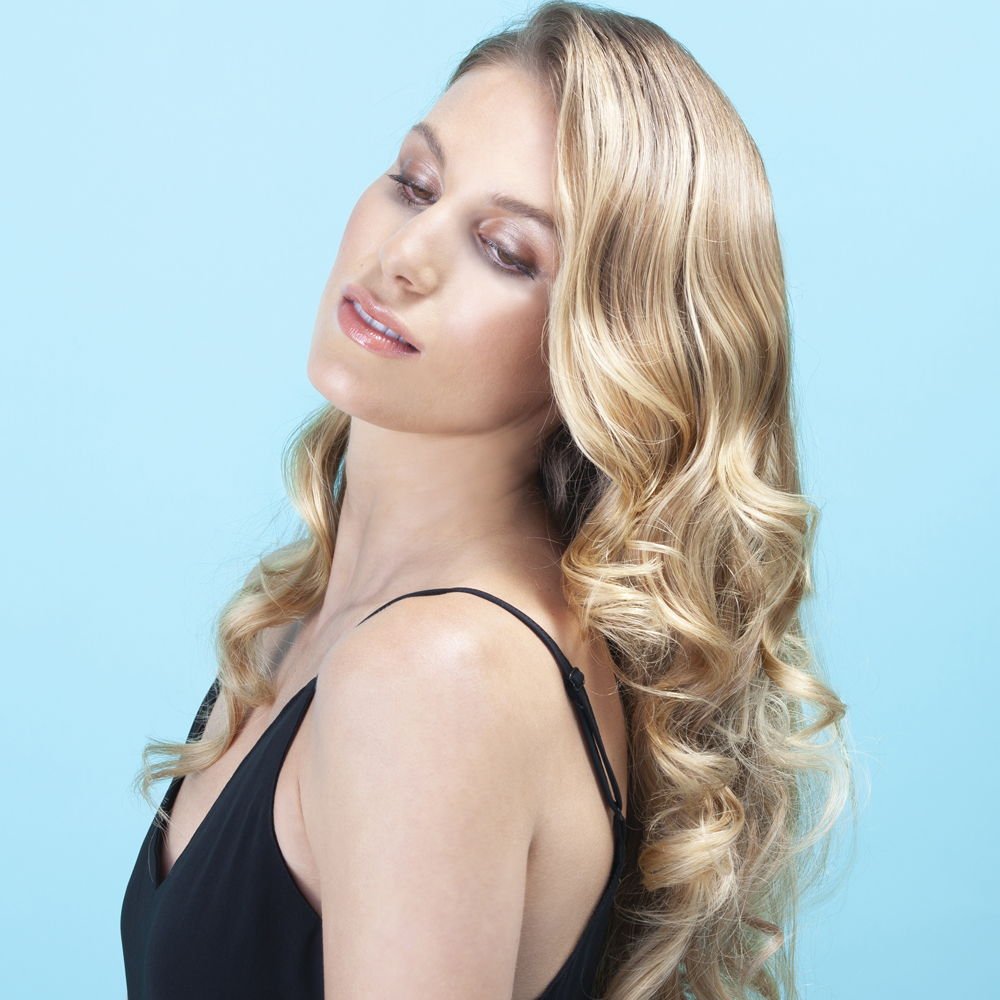
Our Solution
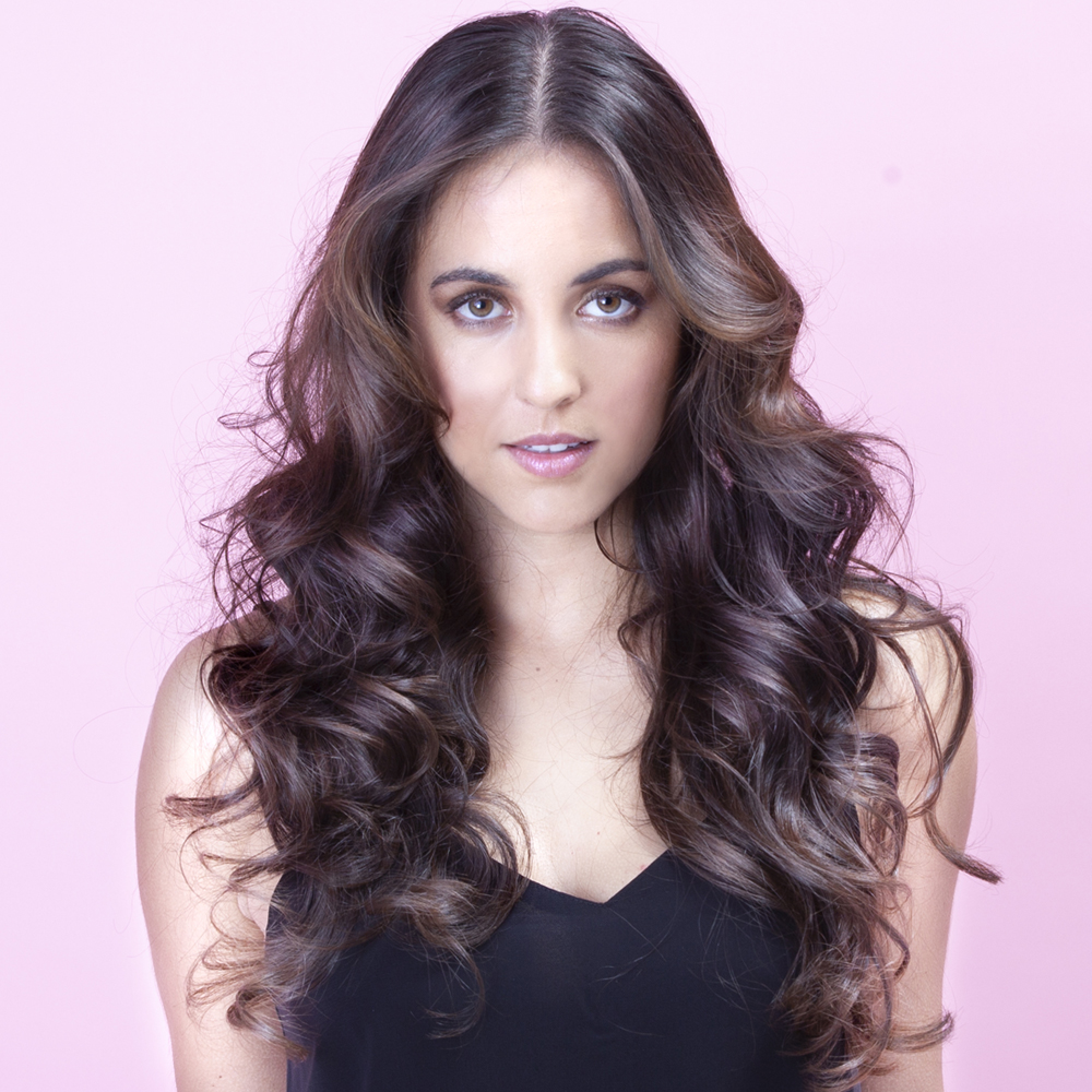
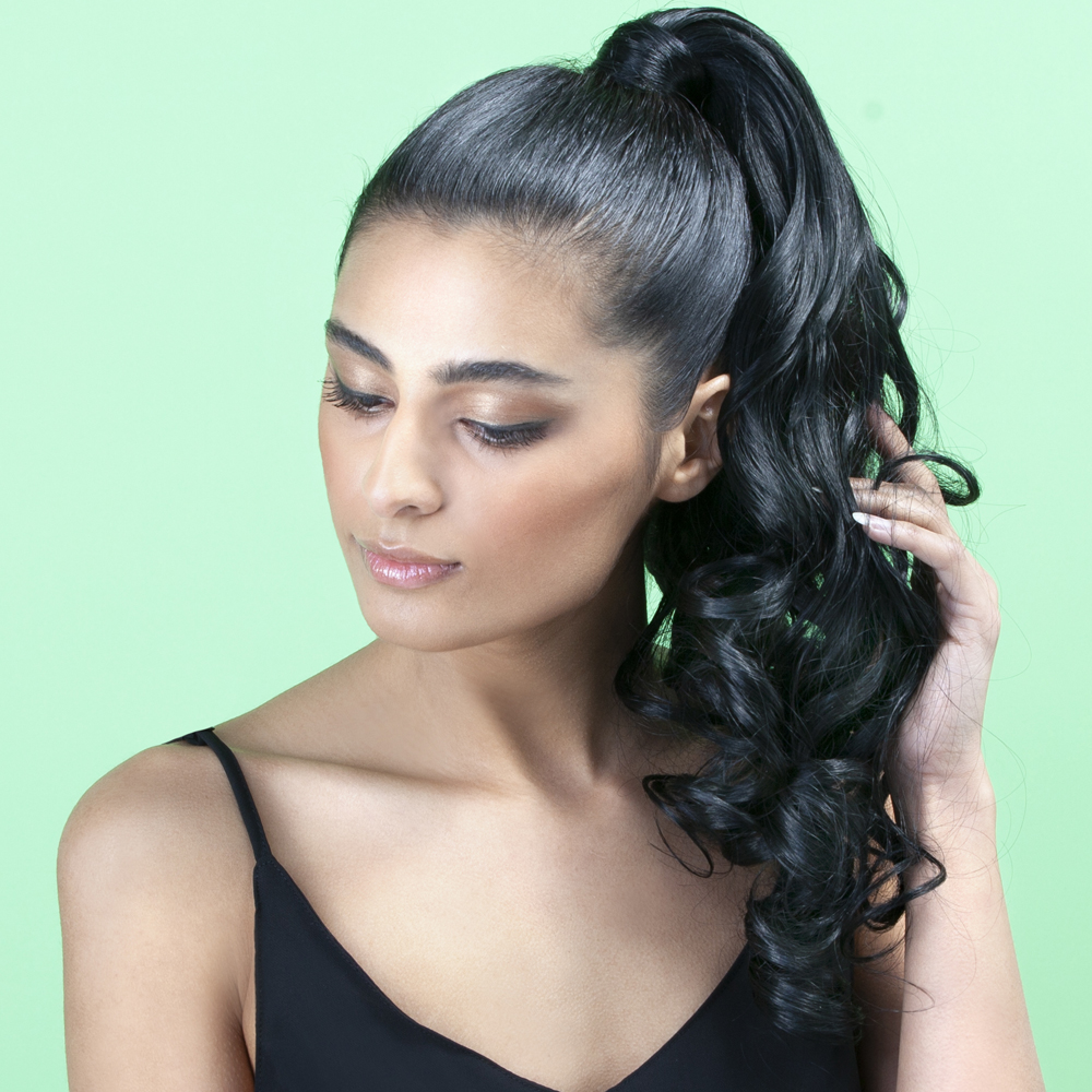
Using three different models to showcase how natural the extensions can look. Ususally hair extension were portrayed as very fake looking but we positioned it as some this use for volume and special occassions styles. Clean pop of colour to differentitate between the different types of extensions.
CHECK OUT OUR PORTFOLIO
CONTACT US
Like what you see? Get a quick quote.
Our latest work and antics are on Instagram

This error message is only visible to WordPress admins
There has been a problem with your Instagram Feed.